100 Jahre "Neue Typographie"
In the organizer's words:
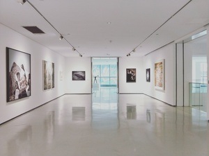
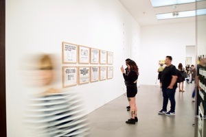
It is typeface that gives language a face. Exactly one hundred years ago, a new, minimalist typography was discovered in the environment of the Bauhaus and its comrades-in-arms. Without these revolutionary changes and foundations, brand logos and typefaces from CHANEL and LAMY to WMF and Apple would have remained unthinkable. Now a small but fine special exhibition at the German Packaging Museum is dedicated to these connections.
The Bauhaus artist László Moholy-Nagy made the start in 1923, the year of crisis in the Weimar Republic: one hundred years ago, he formulated the claim of a 'typographic revolution' and thus marked the beginning of the so-called Bauhaus typeface - supported by famous typographers of the time, such as Jan Tschichold: away from the serif-emphasized Antiqua to the functionalist-technoid grotesque, which created its monument with Paul Renner's 'Futura' in 1927. This typeface has made it from designs for the "Persil" detergent brand to Stanley Kubrick's classic film "2001 - A Space Odyssey" to the landing of Apollo 11 on the moon in 1969. This revolution in typeface design was and still is an integral part of brand and packaging design - right up to the present day. In its special exhibition, the German Packaging Museum shows the change from the "old style" to the new design - with the uncertainties at the beginning, the consistent implementation in the 1930s up to today's brand and packaging design.
This content has been machine translated.
Location
You might enjoy this as well?


The best event recommendations for the Rausgegangen App!